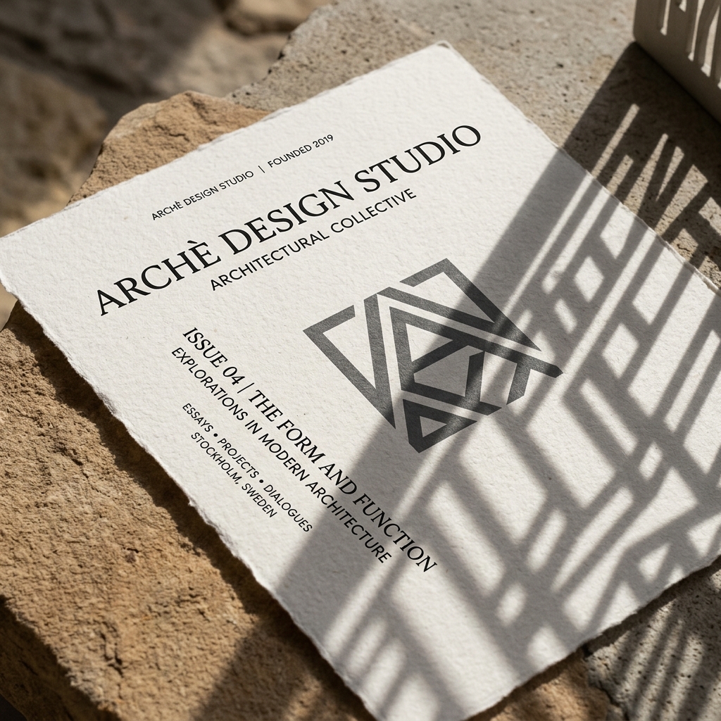
In a noisy digital landscape, quietness is the ultimate form of loudness. Stark minimalism is not about empty space; it is about absolute intent.
The Grid is Your Foundation
Minimalist design is architectural. By adhering strictly to a grid system, we create structural trust. Every margins, font size ratio, and line element must serve a purpose. When designing visual identities for luxury fashion and architectural studios, the placement of copy is as critical as the typography itself.
Static vs. Motion Design
A brand is no longer static. It lives on phone screens, billboards, and video intros. The challenge is ensuring that a minimal logo system retains its gravity when animated. The animation itself should be minimal—a subtle slide, a fade that tracks with camera movement, or a letter spacing expansion.
"Minimalism is not the lack of something. It is the perfect amount of something."
Curated Palettes
Limit your palette to elevate the design. Monochrome designs with a single, highly deliberate accent color can anchor a brand's tone. The goal is to focus on material textures—the matte of the paper, the light dispersion in a film frame—rather than relying on flashy gradients.
Process & Layout Experiments
In our branding systems, we conduct extensive experiments with paper weights, ink absorption, and digital layouts. Below are visual samples demonstrating our dynamic grid alignments: